Design and commercial
| KOM Construction | Visual Identity, Web Design & Development | |
| Bleu Bikinis | Branding, Web Design, Photography | |
| The Standard Residences | Web Design | |
| Ben Segal Website | Web Design + Programming | |
| Emperatrix Display | Typography Design | |
| Anastasia Miseyko Photography | Web Design & Development | |
| Seapods Portfolio | Editorial | |
| Mad Cool Festival | Rebranding, Motion Graphics | |
| Maison Palm | Branding, Motion Graphics | |
| Museo Nacional de Artes Decorativas | Rebranding, Advertising | |
| Dominga | Editorial | |
Artistic works
| In a Moment | Photography | |
| Modern Mannequin | Photography, Editorial | |
| Pendulum | Installation, Exhibition | |
| Anthropocene | Painting |
Contact
| maarek.mel@gmail.com | ||
| @melmaarek |
| Curriculum Vitae | Download PDF |
Emperatrix Display
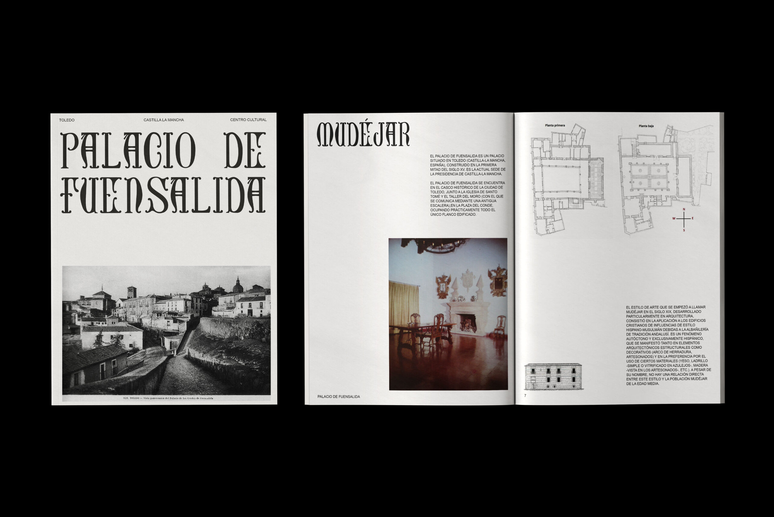
Emperatrix Display is a typeface inspired by the elegant lettering found in the Palacio de Fuensalida, a historic landmark in Toledo, Spain. Known for its mix of Gothic and Mudéjar styles, this palace was once home to Empress Isabel of Portugal, adding a regal touch to its intricate stone and wood carvings.
Taking cues from the palace’s inscriptions, Emperatrix Display blends bold, refined strokes with classic details, capturing the grandeur of 16th-century Spanish craftsmanship. It’s designed to feel both historical and fresh, perfect for branding, editorial work, and display use.
Emperatrix Display brings a bit of Toledo’s timeless elegance and history into the modern world.